Designing a scalable Onboarding Tool to reduce manual work and boost clarity
Project overview
I led the redesign of MyOnboarding, a core tool for managing employee onboarding at Haufe group, creating a personalized and scalable experience.
The result: streamlined onboarding, increased HR adoption, and improved new hire satisfaction. This work enabled HR to move from fragmented spreadsheets to a single point of truth for onboarding while providing new joiners with a clear, supportive journey from day one.
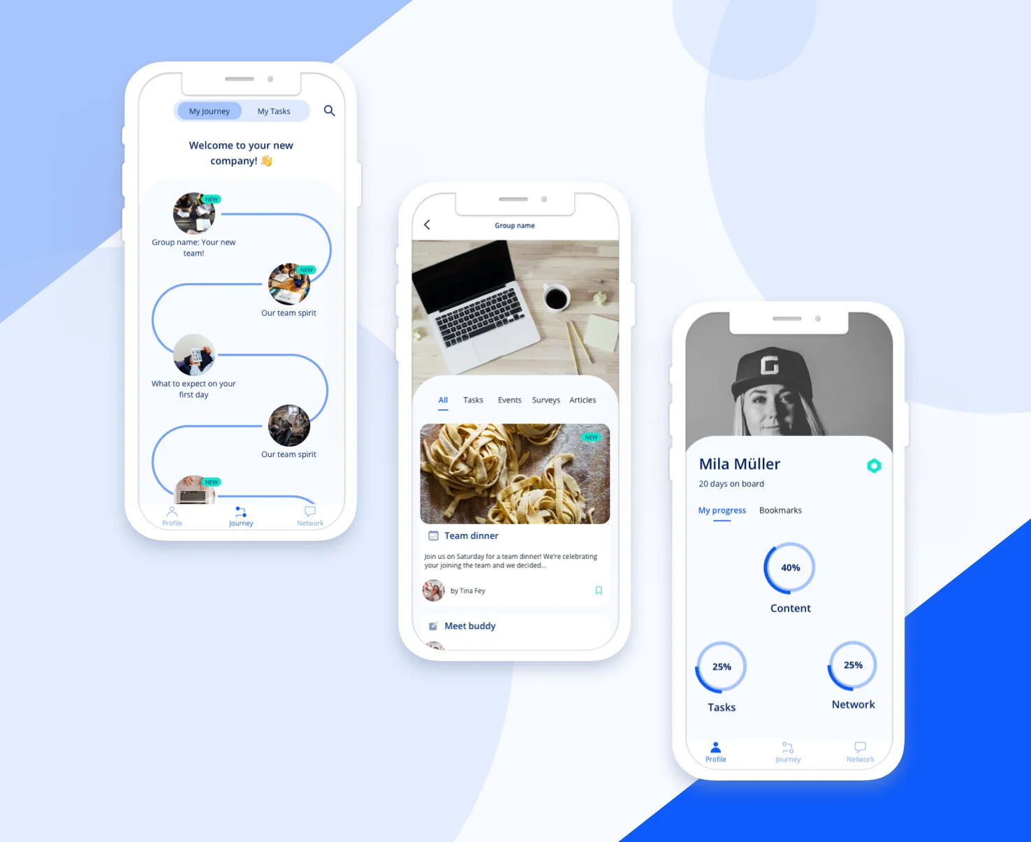
Detail screens of the high-fidelity design for the onboarding iOS mobile application.
Impact summary
📈 Boosted onboarding task completion rates by 25% within the first week of rollout
🙌 Improved new hire satisfaction scores in onboarding surveys, with +15% increase in clarity and support ratings
🔍 Created a single source of truth for onboarding activities, reducing reliance on spreadsheets and email
🔄 Enabled scalable onboarding via role-based templates adaptable to team-specific needs
Client
Haufe group
Duration
4 months
Methods
Journey mapping, user interviews, prototyping, usability testing, gamification experimentation
My role
Product Designer, Researcher, Service designer
Team
Product owner, Engineering Lead, 3 Engineers, 1 Product analyst, 2 Product Designers
The design steps
Getting the context
Understand current user journey experience. Identify challenges for users and establish opportunities for experimentation.
Framing
Prioritise and ideate on major pain points for users and the service. De-risk opportunities and set the hypothesis for the prototype exploration.
Exploration
Sketch alternative journeys, test prototypes, iterate on findings and refine touchpoints. Experiment with gamification to enhance engagement with the app.
Delivery
Consolidate findings into most reliable first delivery candidate. Work closely with engineering and product management to refine prototype. Evaluate with users.
Getting the context - Journey mapping, User interviews
As the Lead Product Designer, I partnered closely with HR, engineering, and product to align the redesign with company-wide employee experience goals. I facilitated workshops, mapped end-to-end service blueprints, created personas and prioritized key pain points based on impact to internal users. I also coordinated testing sessions with HR and new joiners to ensure usability and alignment with real workflows.
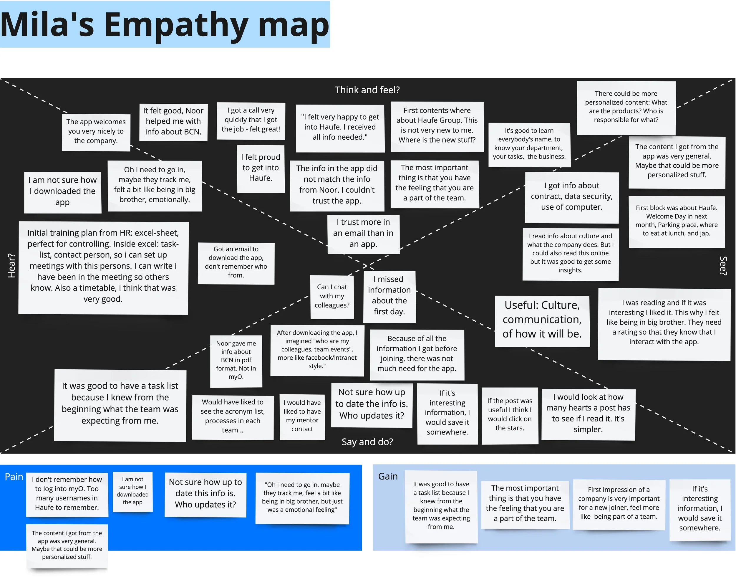
Empathy map for Mila, the onboardee.
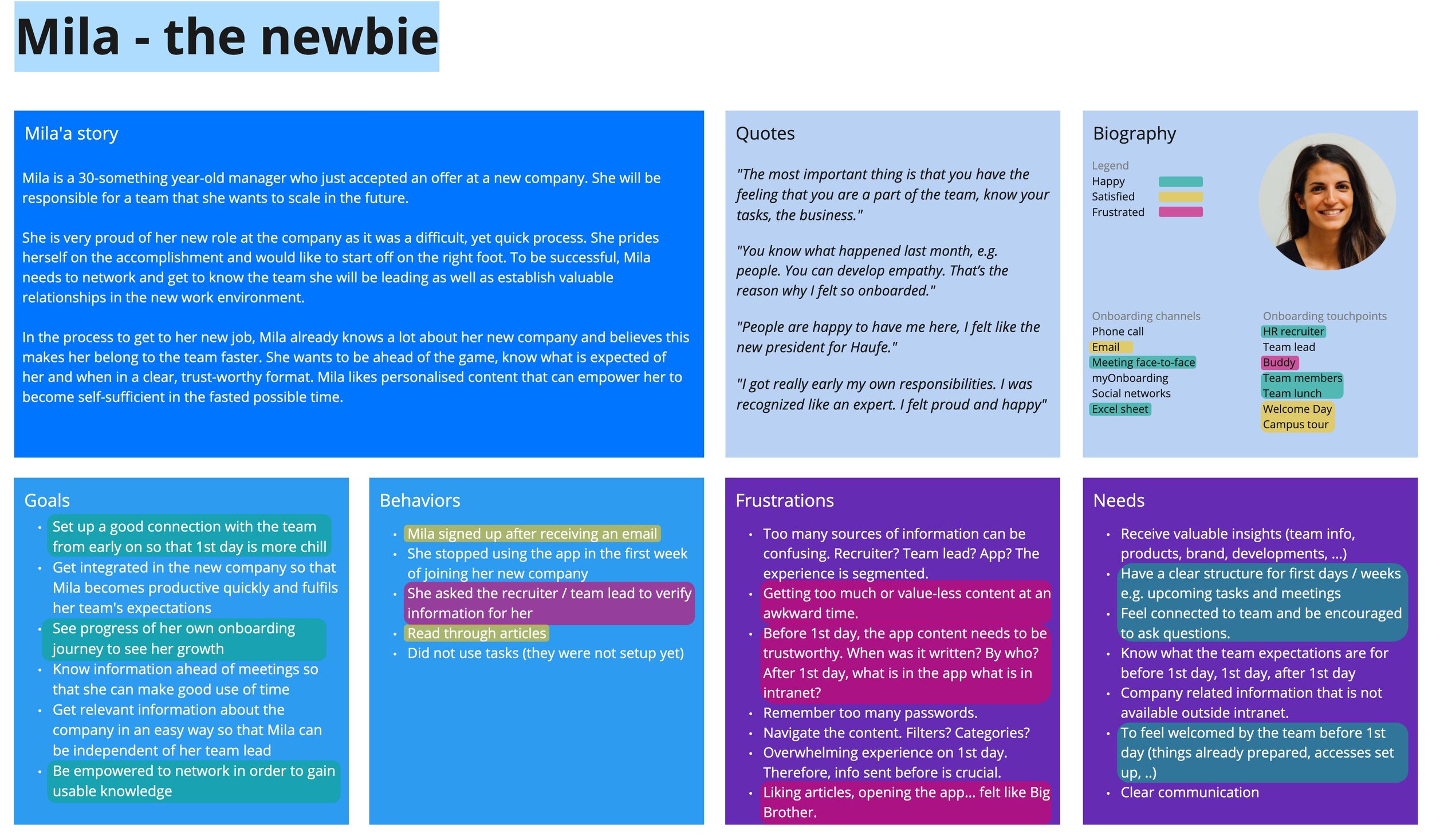
Persona definition for Mila, the onboardee.

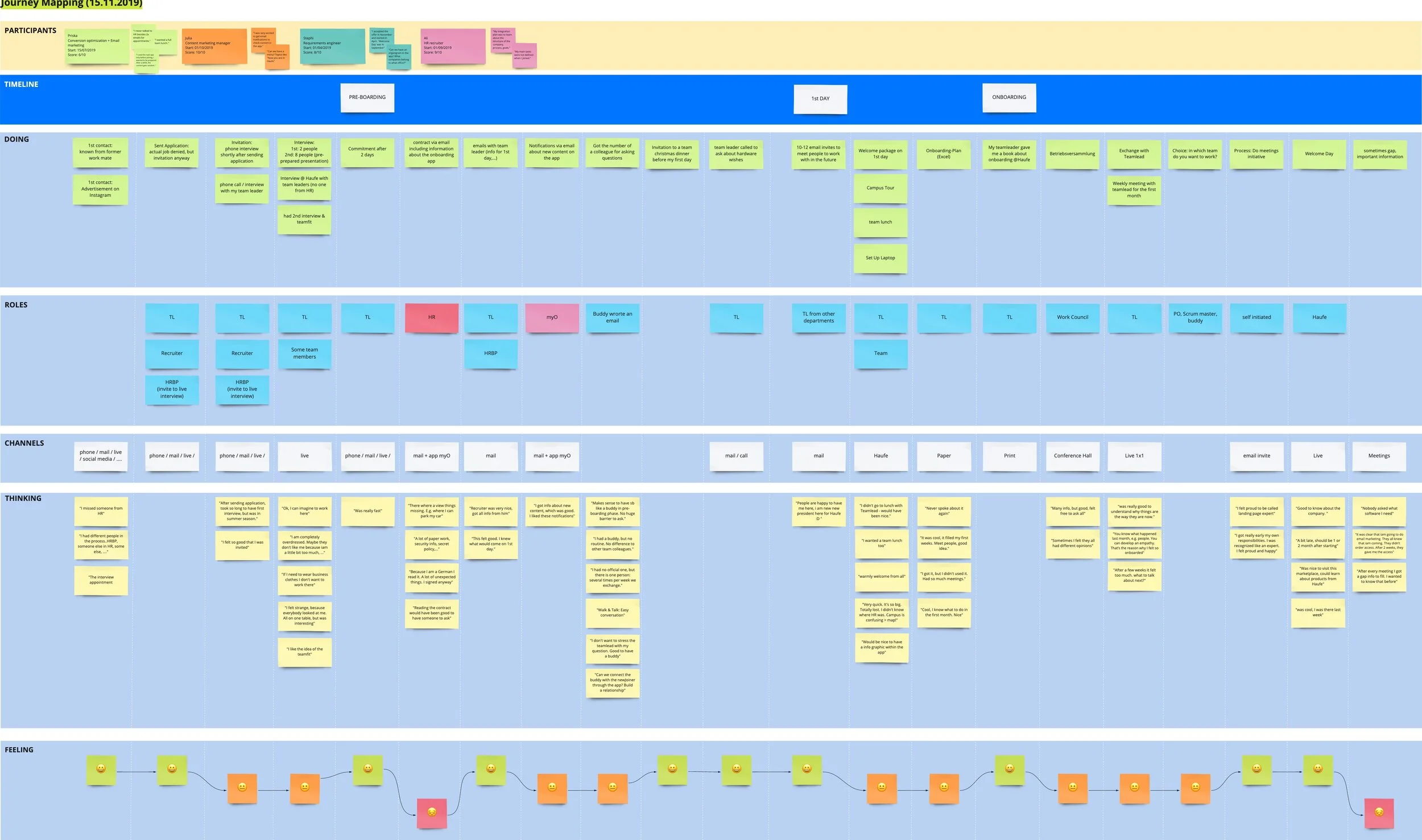
Journey mapping exercise in person to understand the onboarding experience.
Journey mapping exercise digitalised for easier collaboration.
Discoveries
New joiners did not feel the app content was personalised enough. They shared feelings of disengagement with the company.
There was a shared sentiment of being watched, users mentioning that they engaged with the app’s content for fear their usage is monitored.
The information about the app was shared late and the intention for its usage was unclear to new joiners.
New joiners didn’t know what to expect or who to talk to.
HR teams spent excessive time updating and checking task progress.
No standardized structure; teams used different onboarding flows.
HR teams relied on spreadsheets and emails, and the tool’s existing UI caused confusion, delays, and a lack of clarity around onboarding progress.
Framing - Establishing pain points and opportunities
After these activities I presented the findings to the extended team. Together with the Product Owner and the Jr Designer, I framed the problems we would like to focus on first, based on the main persona needs and frustrations and low experience points in the journey maps.
Once we framed the main problems we wanted to solve, I organized a divergent brainstorming session with the extended team in order to explore the many options we have for solving these problems.
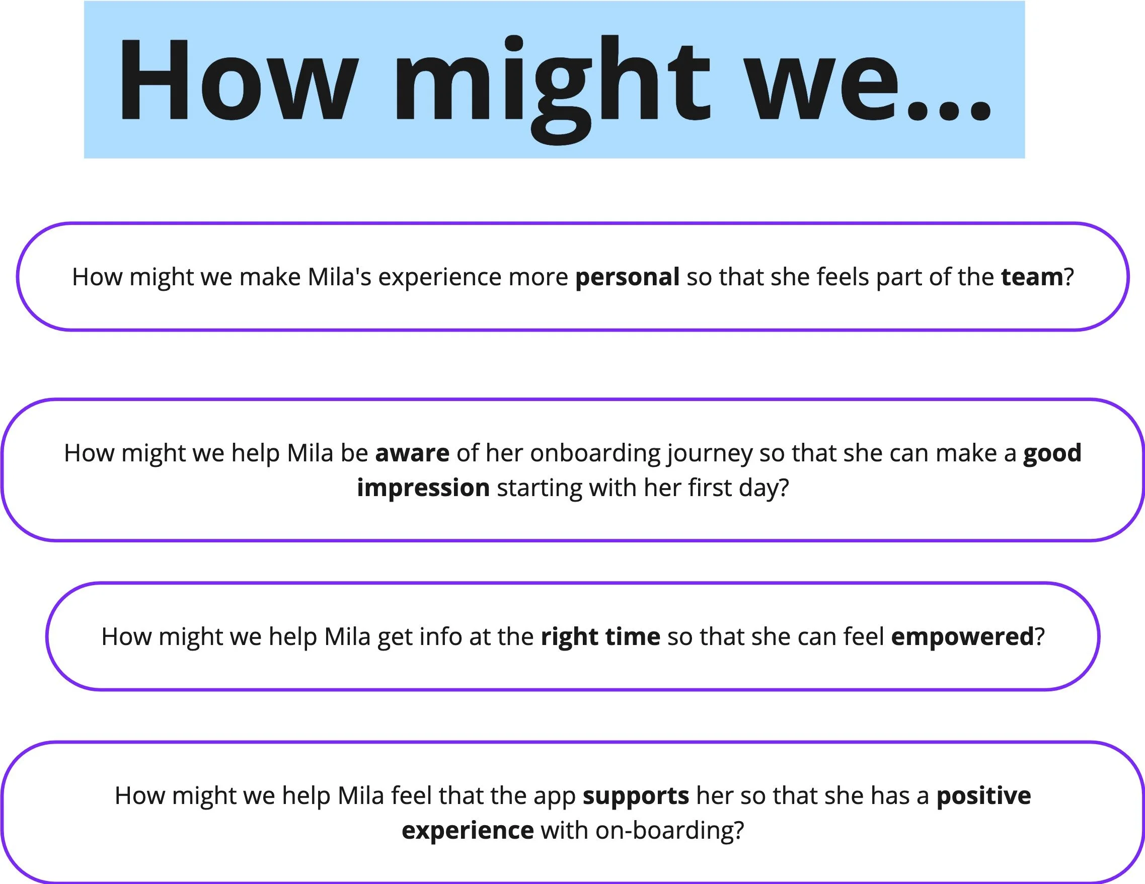

Problem statement framing with How might we questions used in an ideation session.
Decisions
Explore gamification elements to make the app usage more engaging.
Improve on the communication strategy when introducing the myOnboarding application to users.
Make the onboarding journey more clear in the application in order to empower the new joiner.
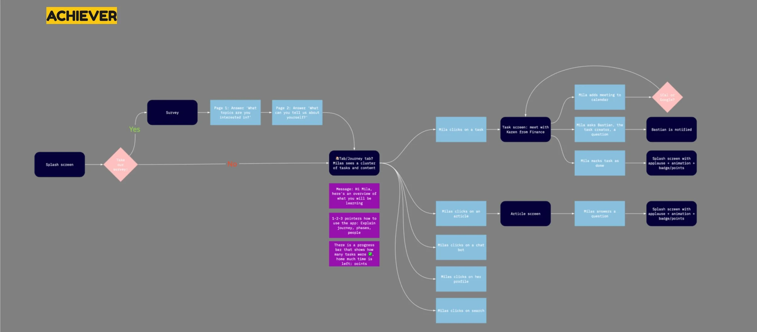
Exploration - Gamification elements, Low- to High-fidelity testing
I explored an octalysis framework - a gamification method for making applications engaging - and prioritised the ideas that best helped achieve the HMW goals:
Engaging experience: Networking elements*, Assigning a Buddy
Clear journey: Progress is visible (progress bars, clear countdown to task completion, animate once task is done etc), Notifications
Personalised space: Choosing a theme*, Profile space with stats, Bookmarks
*Further invalidated during testing
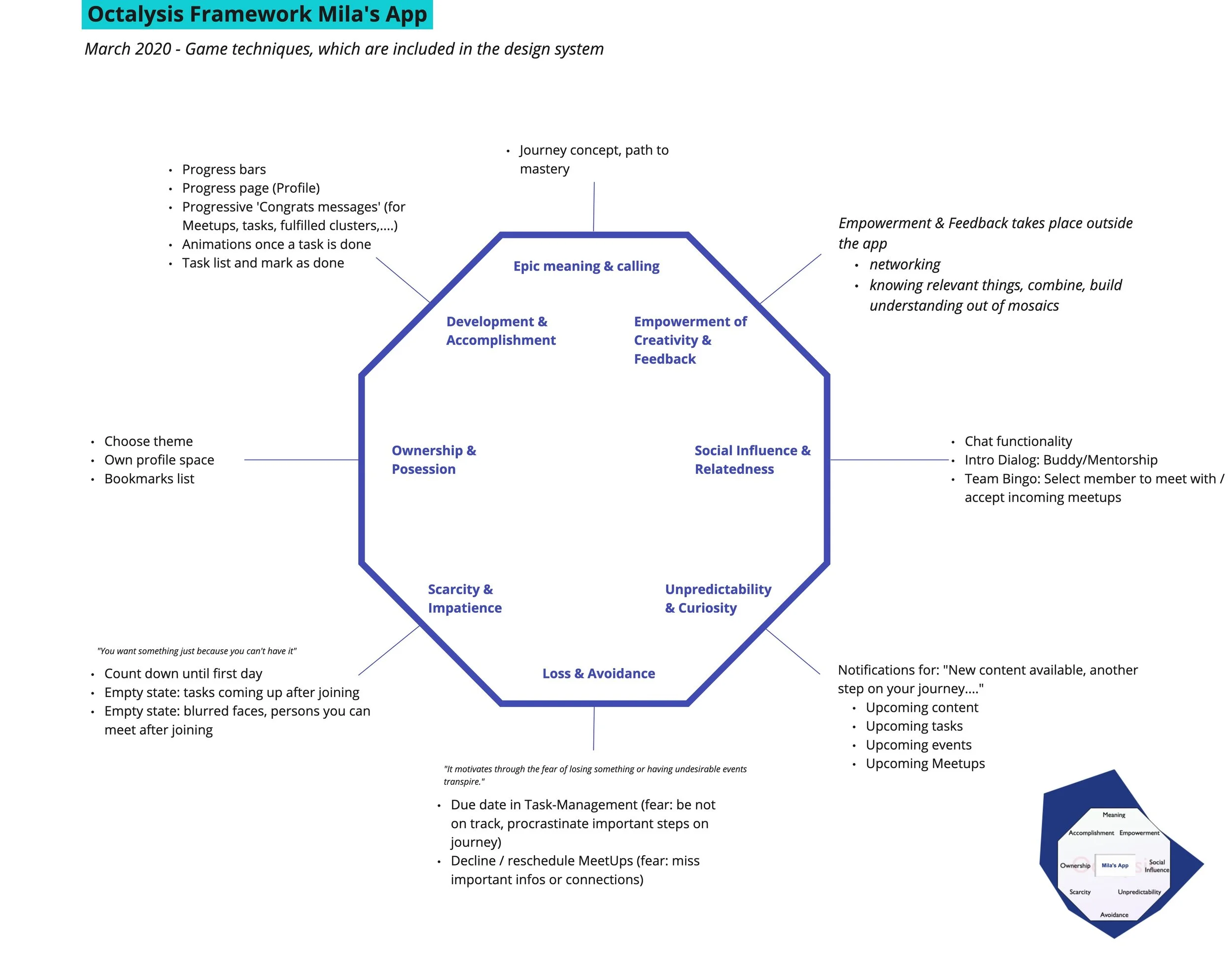
The octalysis framework helped priorise app gamification elements.
Prototyping and testing
After the octalysis workshops with the team, I started prototyping against the 3 main gamification swim-lanes users had shown a preference for:
Socialising: “The most important thing is that you have the feeling that you are a part of the team.”
Exploring: “After downloading the app, I imagined I would find a multitude of information about who are my colleagues, team events etc, more like facebook/intranet style.“
Achieving*: “It was good to have a task list because I knew from the beginning what the team was expecting from me.”
*This goal stemmed from the HR admin and Team lead user side, and was invalidated further along the process by onboardees.
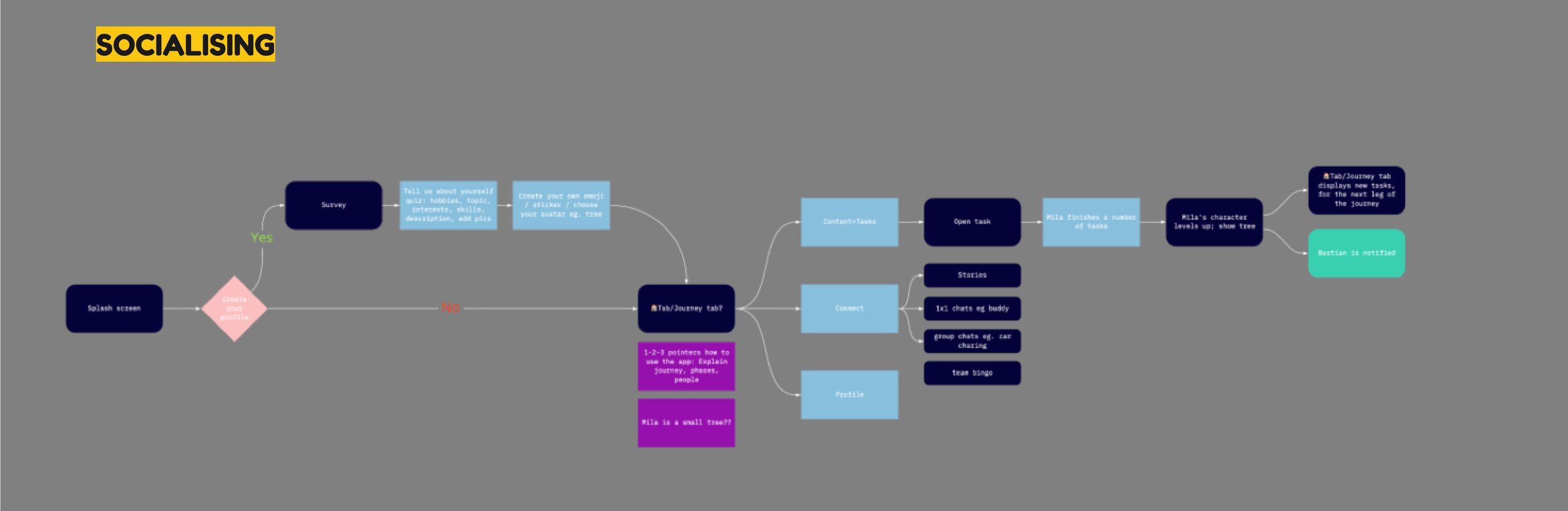
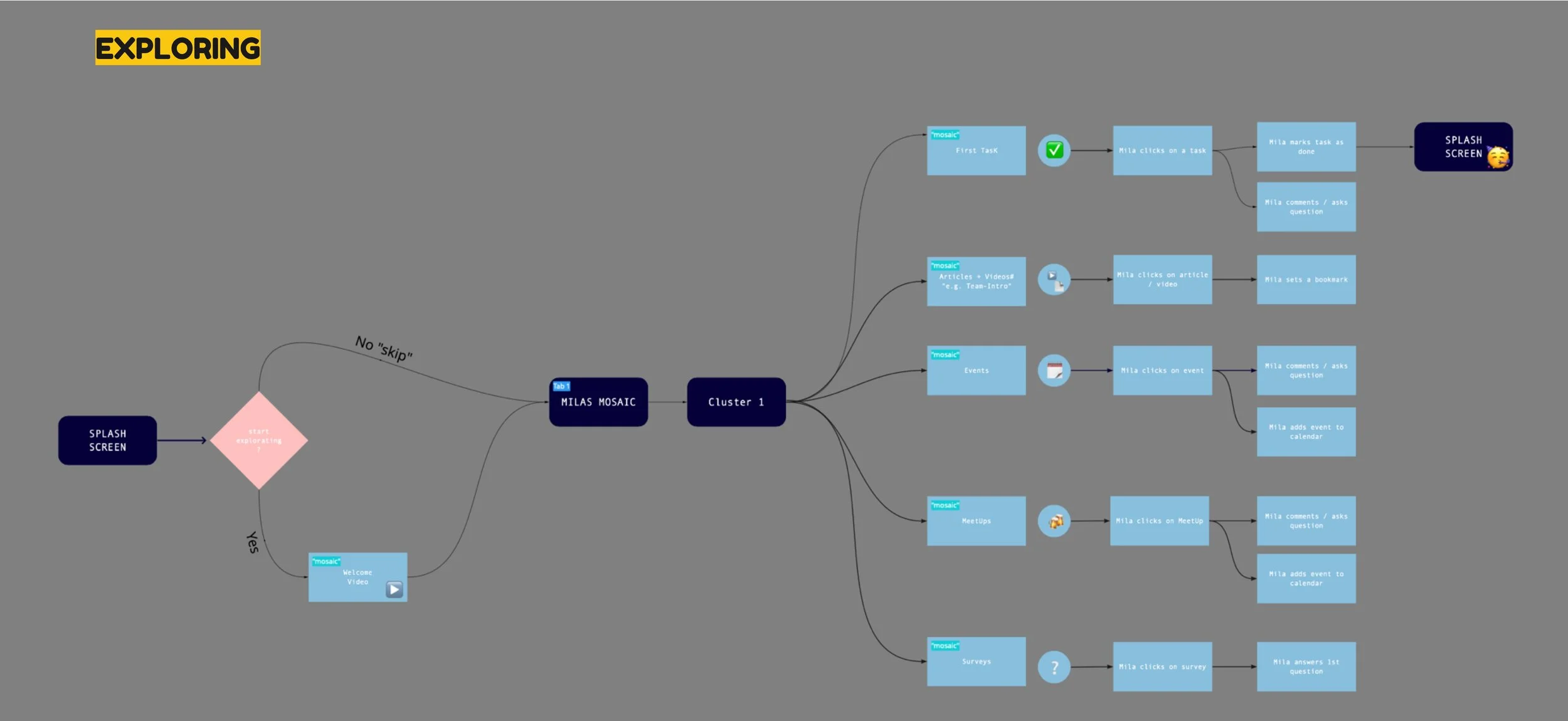
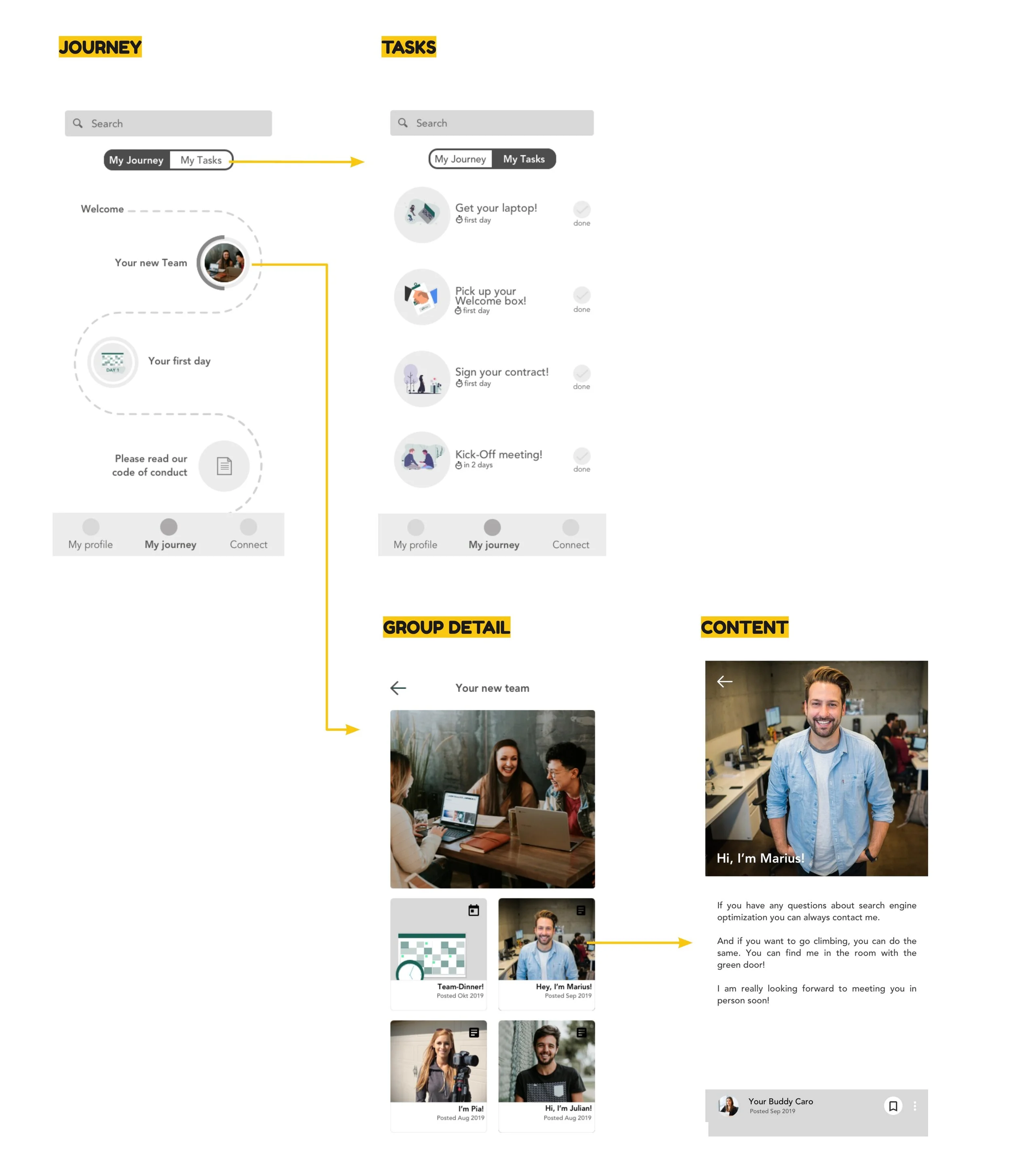
3 different user flows based on the 3 app exploration types.
2 rounds
I facilitated 2 rounds of usability testing, from low to high fidelity.
3+
Every round I iterated on the prototype.
Desirability toolkit
At the end of the usability tests I ran an additional Microsoft desirability toolkit test to better craft the visual design experience.

Showing 3 main screens for each type of experience explored as part of the first round of testing.
Discoveries and decisions
The achiever type gamification (points, levels, unlocking content through time) were perceived as having a ‘Big brother’ effect on new joiners and was discarded.
Most users preferred a combination of exploring + socialising:
the socialising aspects (ways to get in contact with the creators of articles and tasks, networking function, comment function)
the explorer type (information should be laid out through progressive disclosure, content and tasks should be grouped).
A second iteration which combines the two gamification types was tested. Users reported the experience as engaging, following a logical path and very clear structure.
Visual desirability test
To better understand what would appeal more to our users, I iterated on versions of the app’s design using the Haufe brand guidelines.
The test them used the Microsoft desirability toolkit: offering positive, negative and neutral words that users had to correlate with the two options. The goal was to see which of the two options is associated with the words we want to transmit through our brand and product. I also collaborated with the marketing team at this stage.
We tested with 12 onboardees. Here are the options and the results:


The light version was preferred.
In general, the light version was considered more clear, fresh and organised. For some users it seemed a bit lackluster so in the next iterations I tried to understand this further and keep experimenting.
Some elements of the dark version were considered more professional which is a characteristic we were aiming for. Therefore I tried to include a few more clean lines and darker colours to the final design, as suggested by users.
Delivery - Design system and Version 1 for release
The next step I took was to organize a workshop with the extended team with the goal of setting the structure of our app design system.
Together with the whole team we cut the interface into small parts and discussed how to split it into components. The result set the basis for our Frontify design system.

Video showing the app design system structure in Frontify.
Images showing some of the final screens of the myOnboarding application.
Conclusion and present state
Upon launching the gamified app, we:
📈 Boosted onboarding task completion rates by 25% within the first week of rollout
🙌 Improved new hire satisfaction scores in onboarding surveys, with +15% increase in clarity and support ratings
🔍 Created a single source of truth for onboarding activities, reducing reliance on spreadsheets and email
🔄 Enabled scalable onboarding via role-based templates adaptable to team-specific needs
What I would have done differently
Release sooner
This project was my first leadership project where I was leading all stages of the design process from research phase to final specs for the developers. Needless to say I was a bit worried to fail, so I erred on the safe side by testing many times in prototype phase. With more experience now I would be able to run faster and with more confidence through some of the testing phases in order to release and learn then iterate.
